


Cut Friction, Not Features: Shopify One Page Checkout, Trim to Eight Fields
Shopify’s one-page checkout condenses contact details, shipping, and payment into a single scrollable view, and it’s the sensible default for most stores. The catch is that switching layouts does nothing on its own. You need to strip out unnecessary fields, confirm express payments still collect the data your fulfilment process needs, and test on real devices before you trust the results. Start in Settings → Checkout, where you can preview the current setup or switch layouts without touching live traffic.
TL;DR:
- Reducing form fields to around eight and enabling guest checkout can significantly improve checkout conversion rates.
- Accelerated payment options like Shop Pay, Apple Pay, and Google Pay speed up checkout but may bypass custom extension data collection.
- Testing on real devices and browsers before going live ensures mobile rendering, payment method display, and branding match expectations.
- Three-page checkout remains effective for complex shipping, validation, or legal verification, while one-page suits straightforward consumer orders.
- An audit by a Shopify specialist can identify potential issues with field setup, extension conflicts, and mobile performance before launching or migrating.
Table of Contents
- What Shopify’s one-page checkout actually shows
- One-page vs three-page checkout: which one fits your store?
- How to enable and preview one-page checkout in Shopify
- The optimisation checklist that actually moves conversion
- Where accelerated payments and checkout extensions collide
- Testing your checkout before and after you launch
- The minimal safe checklist for going live
- What we’ve learned rolling out checkout changes for clients
- Get your checkout audited before you flip anything live
- Sources
- FAQ
What Shopify’s one-page checkout actually shows
The one-page layout stacks four elements down a single page: an order summary at the top or side, a contact field, shipping address and delivery method, and payment. Discount codes sit in their own field, usually just above the order total, so shoppers don’t have to hunt for it buried in a separate step. Shopify’s own documentation confirms this consolidation is the defining feature: everything that used to span three pages now lives on one.
What most merchants don’t realise until they’ve watched a session recording is how much the page changes shape depending on who’s buying. If a customer is logged into their Shop account or has checked out before on that browser, Shopify prefills contact and shipping details and collapses them into a compact rollup, a single summarised line instead of an open form. That rollup is expandable, but the default view hides the fields entirely. This is deliberate: returning customers see fewer inputs, first-time buyers see more.
Payment method ordering is worth watching closely, because Shopify doesn’t always show your methods in the order you configured them in the admin. Shop Pay, when active, tends to surface prominently near the top of the payment block because it accelerates checkout for anyone with a saved Shop wallet. That’s good for conversion among returning Shop users, but if you’re running a promotion tied to a specific payment method, check the live checkout rather than assuming your admin order is what shoppers see.
Availability depends on your plan and setup. One-page checkout is the default for most current Shopify stores, including those on Basic, Shopify, and Advanced plans, and Shopify Plus merchants using checkout extensibility get the same base layout with more customisation room through Checkout UI extensions. If you’re on an older store built before the redesign, or you migrated from a legacy checkout.liquid setup, you may need to explicitly switch over. Before you do, check any custom checkout scripts or third-party apps tied to the old checkout.liquid file. Shopify’s own migration guidance flags this as the most common upgrade snag, and it’s worth confirming nothing breaks before you flip the switch on a live store.
One-page vs three-page checkout: which one fits your store?
One-page checkout wins on conversion for the majority of stores, mainly because it removes the psychological friction of “how many more steps is this going to take.” Fewer page loads also means fewer chances for a slow connection or a confused tap to knock someone out of the funnel. But it’s not automatically better; a single page crammed with fifteen fields can feel more overwhelming than three clean steps with five fields each. Conversion experts at Baymard have made this point directly: step count alone is a weak proxy for checkout quality. Perceived complexity matters more than the number of pages, and a short one-page form loaded with unnecessary inputs can underperform a longer flow that only asks what it needs.
Three-page checkout still earns its place in specific situations:
- Complex shipping logic. Multi-address orders, split shipments, or freight quotes that need a dedicated calculation step.
- Heavy validation requirements. B2B stores collecting tax IDs, purchase order numbers, or approval workflows that need their own confirmation screen.
- Regulated or age-gated products. Where a distinct verification step protects you legally and needs to be unmissable rather than folded into a scroll.
- Very long product configuration. Custom orders where shipping options depend on choices made earlier in the flow.
For a general apparel, beauty, or home-goods store selling to consumers with straightforward shipping, one-page checkout is the right starting point. For a wholesale operation collecting business registration numbers and requiring manager approval before an order is confirmed, three-page (or a heavily customised one-page with conditional logic) makes more sense. The decision rule is simple: if your checkout genuinely needs distinct stages of validation, keep the stages. If it doesn’t, collapse them.
How to enable and preview one-page checkout in Shopify
Switching layouts is a five-minute admin task, but getting it right takes a bit more care than clicking a toggle. Here’s the sequence that avoids surprises:
- Go to Settings → Checkout in your Shopify admin. This is where layout, branding, and field configuration all live.
- Open the checkout editor and locate the layout switcher. Depending on your plan, you’ll see an option to create a draft checkout or customise the existing one directly. Working from a draft lets you make changes without affecting live orders until you’re ready to publish.
- Select one-page (or confirm it’s already active). Most stores created after the checkout redesign default to one-page, so you may simply be reviewing rather than switching.
- Use the built-in preview to check the visual layout. This shows you field order, branding, and rollup behaviour, but treat it as a first pass, not a final QA step.
- Preview on an actual phone and a real browser, not just the in-editor preview window. The editor preview runs inside an iframe on your desktop screen, and it does not reliably replicate how mobile Safari or Chrome renders payment buttons, keyboard behaviour, or autofill prompts. Open the live preview link on your own phone before you publish anything.
- Check payment method availability. Confirm every payment method you’ve configured actually appears, in a sensible order, and that region-specific methods show correctly if you sell internationally.
- Confirm discount field placement and function. Test an active discount code end to end. A field that looks right but silently fails to apply is a very common post-migration bug.
- Review the order summary for accuracy. Line items, shipping costs, and tax should all match what a shopper would see at cart level, with no mismatched totals.
- Check branding consistency. Logo, colours, and fonts on the checkout page should match your storefront. A jarring mismatch here is one of the fastest ways to make a checkout feel untrustworthy.
- Publish only after all of the above pass on at least two device types.
Pro Tip: Keep the draft checkout open in one browser tab and your live store in another. Toggling between them makes it far easier to spot subtle differences, like a payment method that appears in the draft but not in production, before you publish.
The optimisation checklist that actually moves conversion
Switching to one-page checkout gives you the frame. What you put inside that frame decides whether it converts. This is where most of the real gains sit, and where most merchants stop too early.
Cut the field count aggressively. Baymard’s checkout usability research found that overly long or complicated checkout processes cause roughly 17% of cart abandonment, and it recommends keeping total form fields close to eight where possible. Every field beyond what you genuinely need to fulfil the order, bill the customer, and contact them about delivery issues is a small tax on your conversion rate. Company name, phone number, and address line 2 are the usual suspects worth reconsidering. If you don’t ship internationally with customs declarations, you probably don’t need a company field at all.
Offer guest checkout as the default path. Forcing account creation before purchase remains one of the most reliable ways to lose an otherwise ready buyer. Shopify supports guest checkout natively, and pairing it with 365-day customer sessions means returning shoppers still get a faster, prefilled experience next time without being forced to log in first.
Make Shop Pay and other express wallets visible, but verify what they skip. Express payment options genuinely speed up checkout for buyers who have them set up, and Shopify’s own guidance on one-page checkout benefits points to wallet adoption as one of the clearer conversion levers in the redesigned flow. Just confirm, before you lean on this, that your extensions still collect any required custom data when a shopper uses an express method (more on that in the next section).
Surface shipping and tax costs early. Unexpected costs appearing for the first time at the final payment step are one of the most common reasons shoppers abandon a cart they were seconds from completing. If your shipping calculator can show an estimate on the cart page or early in checkout, use it.
Label every field as required or optional, explicitly. Baymard’s research on form field labelling found that failing to mark both required and optional fields clearly increases validation errors and mobile usability problems. Don’t rely on an asterisk convention that only some shoppers notice. Hide genuinely non-essential fields like address line 2 by default, and let shoppers reveal them if needed rather than presenting every possible input up front.
Reinforce trust right where the payment happens. A consistent logo, a visible security badge near the card fields, and a short, clear line linking to your returns or refund policy all reduce last-second hesitation. This is not decoration; it’s addressing the specific anxiety a shopper feels the moment they’re about to hand over card details.
Design for mobile first, not as an afterthought. Elevate the pay button so it’s reachable without excessive scrolling, keep touch targets generously sized, and check that autofill and numeric keyboards trigger correctly on both iOS and Android. Given how much of e-commerce traffic now arrives on mobile, according to Statista’s device breakdowns, a checkout that only feels polished on desktop is optimising for the smaller slice of your traffic.
Track the metrics that tell you whether changes actually helped. Checkout completion rate is the headline number, but watch where in the flow abandonment concentrates, and pair conversion wins with guardrails on average order value and refund rate. A completion-rate bump that comes with a spike in refunds isn’t really a win; it may mean shoppers are completing purchases they didn’t fully understand.
Conversion experts generally agree that layout is only the foundation. The real gains come from removing fields that don’t need to exist, refusing to force account creation, and layering in consistent branding and trust cues, exactly the areas most stores leave untouched after they flip the layout switch.
Where accelerated payments and checkout extensions collide
This is the part of one-page checkout that catches even experienced Shopify merchants off guard. Checkout UI extensions, the custom blocks you build for things like delivery date pickers, gift messages, or compliance checkboxes, run inside the standard checkout flow. Accelerated payment methods, particularly Apple Pay and Google Pay, often bypass that flow entirely by completing the transaction through a native wallet interface. Shop Pay has a setting called “Include app in Shop Pay” that can help extensions stay active, but Apple Pay and Google Pay don’t offer an equivalent option in most configurations.
The practical problem this creates is concrete: a shopper picks a delivery date through your custom extension, then completes payment with Apple Pay, and the delivery date never gets written to the order. This isn’t a rare edge case. Developer discussion in Shopify’s community forum confirms this is a known limitation, not a bug that’s about to be patched, and it catches merchants who assumed their extension would run for every payment path.

You have a genuine trade-off to make here, not a clean fix. One option is hiding express payment buttons on any product or cart state where your extension is collecting mandatory data, forcing shoppers through the standard flow where the extension actually runs. The other is disabling express methods store-wide if the data you’re collecting is legally or operationally non-negotiable, such as an age verification checkbox or a required customs declaration. Both cost you some conversion from the shoppers who’d have used Apple Pay or Google Pay. Which trade-off is right depends entirely on how critical the missing data actually is; a nice-to-have gift note is not the same risk as a compliance field.
One more thing to check visually rather than assume: rollups from prefilled customer data can push your extension blocks further down the page than you expect, sometimes below the fold on smaller screens. Preview your actual extension placement after enabling one-page checkout, not just the payment and shipping fields.
Testing your checkout before and after you launch
A layout change is not something you ship and forget. Build a short testing protocol and actually run it, ideally before every checkout change and definitely for the first week or two after a bigger one.
- Test across a device and browser matrix. Cover iOS Safari, Android Chrome, and at least one desktop browser, and include express wallet scenarios (Apple Pay on iOS, Google Pay on Android) alongside standard card entry.
- Run through the core test cases manually. Guest checkout, a logged-in account flow, an express wallet purchase, a deliberately invalid address to check validation messaging, and a payment failure to confirm the error state is clear.
- Confirm tax and shipping visibility at each stage, not just at final payment.
- If you’re running an A/B test on layout or field changes, commit to a real sample size and run-time before drawing conclusions, and track conversion rate alongside average order value and refund rate so you catch a false win.
- Monitor closely for the first 7 to 14 days after launch. Set a rollback trigger in advance, for instance a defined drop in completion rate or a spike in support tickets about checkout errors, so you’re not making that call emotionally in the moment.
Practitioner analysis of the redesigned Shopify checkout backs up the general pattern: most of the baseline friction has already been engineered out by Shopify itself, so the merchant’s real job now is configuration, measurement, and fixing the surrounding friction points, not re-inventing the layout.
The minimal safe checklist for going live
One-page checkout is the right default for most stores, provided you don’t stop at flipping the switch. The minimal pre-launch checklist is short: field count trimmed close to eight, guest checkout enabled, express payment data-collection confirmed, mobile preview tested on a real device, and a rollback trigger defined before you publish.
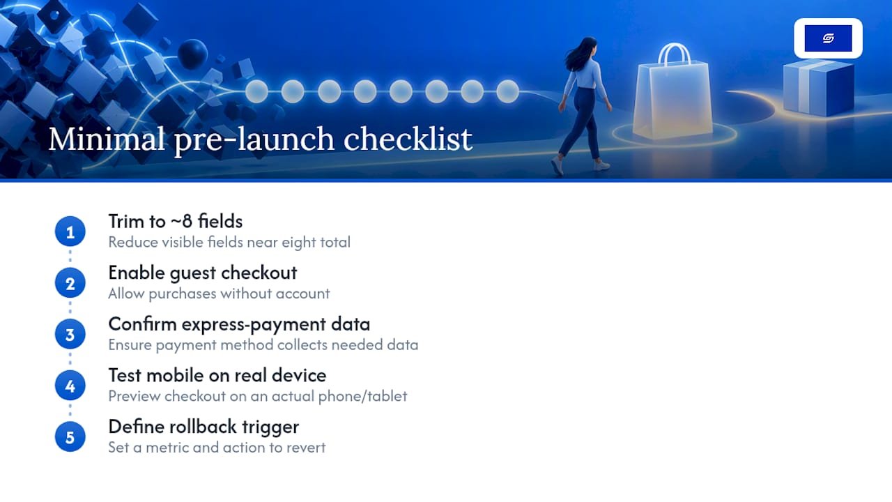
Treat the launch as the start of measurement, not the end of the project. Completion rate, abandonment point, and refund rate will tell you more in the first two weeks than any amount of pre-launch speculation. For a structured way to work through this, Soodo’s Shopify optimisation checklist and CRO fixes for Shopify stores are both practical next steps if you want a second pass before you commit.
What we’ve learned rolling out checkout changes for clients
The mistake we see most often is a store flipping to one-page checkout and treating that as the optimisation, when it’s really just the starting point. No field audit, no mobile QA, no rollback plan, just a layout switch and a hope that conversion goes up on its own. Sometimes it does. Often the gains are smaller than expected, because the fields, the wallet data-collection gaps, and the trust signals were never touched.
We treat every checkout change as a hypothesis, not a guess. That means testing on real devices before publishing, defining what “success” and “rollback” look like before the change goes live, and validating with A/B data rather than a feeling. The TAHAN case study is a good example of what happens when landing page and checkout work get treated with the same rigour.
— Soodo
Get your checkout audited before you flip anything live
Getting the layout right is one job. Getting the fields, express payment behaviour, and mobile rendering right at the same time is a different, harder job, and it’s exactly where Soodo’s Existing Shopify Store Optimization service focuses. A specialized Shopify agency builds and audits checkout processes with real operator experience behind it, not a generic template applied to every store the same way.
If you’re migrating from another platform and rebuilding checkout from scratch, the Platform migration service, priced from 4,000 SGD for a full new Shopify website build, covers checkout configuration as part of the wider setup. If your store already runs on Shopify and you just need the checkout itself reviewed, tightened, and tested, that’s the more targeted Existing Shopify Store Optimization engagement, priced from 1,600 SGD. Reach out through the Soodo contact page to scope a small, focused checkout audit before you make changes to a live store.
Sources
Shopify’s own one-page checkout documentation is the authoritative reference on layout behaviour and admin settings. For the underlying UX research behind field-count and labelling recommendations, Baymard’s checkout usability report and its study on required and optional field labelling are both worth reading directly. Developers dealing with extension and express-payment conflicts should follow the Shopify Community thread on Checkout UI extensions, and readers who want broader conversion methodology beyond checkout specifics can review Baby Love Growth’s CRO guidance.
- One-page checkout — Shopify Help
- Will accelerated payment (express) methods ever work with Checkout UI extensions? — Shopify Community
FAQ
Is one-page checkout the default on all Shopify plans?
Yes, one-page checkout is the default layout for most current Shopify stores, including Basic, Shopify, and Advanced plans, following Shopify’s checkout redesign. Stores built before the redesign or migrated from older checkout.liquid setups may need to switch manually in Settings → Checkout.
Does one-page checkout always convert better than three-page checkout?
Not always. One-page checkout tends to reduce friction for straightforward orders, but Baymard’s research shows perceived complexity, not page count, predicts abandonment, so a cluttered single page can underperform a clean multi-step flow.
Why isn’t my custom checkout data saving when customers use Apple Pay?
Accelerated payment methods like Apple Pay and Google Pay commonly bypass Checkout UI extensions entirely, so any custom field your extension collects, such as a delivery date, may never reach the order. The Shopify developer community recommends hiding express options when that data is mandatory.
How many form fields should a Shopify checkout have?
Baymard’s checkout usability benchmark recommends keeping total form fields close to eight, since longer or more complex forms are linked to roughly 17% of cart abandonment. Removing fields like a company name or a second address line, when they’re not essential, is usually the fastest way to get closer to that number.
Can Soodo help audit or rebuild my Shopify checkout?
Yes. Soodo offers Existing Shopify Store Optimization for stores that need their current checkout audited and tightened, priced from 1,600 SGD, alongside full new Shopify website builds from 4,500 SGD for merchants rebuilding from scratch.
Recommended

Jessica Bong
Jessica Bong is the founder of Soodo, a Singapore Shopify agency that builds, revamps and migrates Shopify stores, with every store set up to be found in AI search (GEO). She has spent over 10 years in ecommerce and runs her own Shopify brand, Patch&Bagel, where every Soodo technique is tested first. Jessica is also a WSQ-certified Shopify trainer at Equinet Academy.