


Fix 4 Shopify Product Page Optimization Issues That Rapidly Lift Sales
The fastest wins on Shopify product page optimisation come from four places: a visible, unmissable add-to-cart button, real product photography instead of manufacturer stock shots, unique descriptions written for your actual customer, and a mobile layout that never buries the price, size, or shipping cost. Fix those before touching anything else, because they influence both conversion and how Google reads the page.
TL;DR:
- Ensuring the add-to-cart button is highly visible and within easy reach on both desktop and mobile significantly boosts conversion rates.
- Using unique, detailed product titles and descriptions that highlight the core benefit help both search engines and customers understand the value quickly.
- Optimizing mobile layouts by making size, color options, and cost details immediately accessible prevents drop-offs due to hidden information.
- Implementing structured data with product schema improves search visibility and AI-based shopping tool accuracy, influencing traffic and sales.
- Focusing on high-traffic SKUs and testing one change at a time, while tracking primary and guardrail KPIs, maximizes the efficiency of optimization efforts.
Table of Contents
- What is Shopify product page optimization and where should you start?
- Core page elements: CTA, title, price, variants and descriptions
- How do you optimise Shopify SEO for product pages?
- Image and media strategy that reduces returns
- Why does mobile UX matter more than desktop for Shopify stores?
- How should you A/B test a Shopify product page?
- Technical performance: speed fixes that protect your conversion rate
- Reviews, trust signals and reducing purchase friction
- Which SKUs should you optimise first across your catalogue?
- Why founder-led optimisation catches what generic audits miss
- Get hands-on help optimising your Shopify product pages
- Sources
- FAQ
What is Shopify product page optimization and where should you start?
Shopify product page optimisation is the practice of restructuring the layout, copy, images and technical setup of a product page so it converts more browsers into buyers and ranks better in search. It sits at the intersection of conversion rate optimisation (CRO), search engine optimisation, and plain usability. Merchants often treat these as three separate jobs. They are not. A page with a clear call to action and fast load time tends to satisfy both a shopper and a search crawler at the same time.
Here is the priority order that Soodo works through on client audits, backed by Shopify’s own guidance on improving product pages:
- Add-to-cart visibility and CTA design. If a shopper has to scroll to find the buy button, you are losing sales before they even see your price.
- Product imagery. Studio shots plus lifestyle context, linked correctly to variants.
- Unique product descriptions. Not the manufacturer’s copy pasted in wholesale.
- Mobile layout. Where most of your traffic actually lands.
- Page speed. Slower pages lose shoppers before the content even renders.
- Structured data (schema). So search engines and AI shopping tools can read price, stock and ratings directly.
- Reviews and social proof. Placed where hesitation happens, not buried at the bottom.
- Testing discipline. One change, one KPI, so you know what actually worked.
Run each test with a single primary KPI. If you’re testing a new CTA colour, that KPI is add-to-cart rate, not overall revenue, which moves for a dozen reasons unrelated to your button. Track a guardrail metric alongside it, usually average order value or return rate, so a “win” on your primary metric doesn’t quietly damage something else. Soodo’s Shopify optimisation checklist walks through this in more detail, and the TAHAN case study shows what a structured, prioritised approach looks like when applied to a real regional brand.
Core page elements: CTA, title, price, variants and descriptions
Your buy button carries more weight than any other pixel on the page. It should sit above the fold on desktop and within a single thumb-friendly screen on mobile, using a colour that contrasts with everything around it rather than blending into your brand palette. Add visual feedback the moment someone clicks it: a cart icon animation, a slide-in confirmation, anything that tells the shopper the action registered. Silence after a click reads as a broken button, and broken buttons get abandoned.
Your product title doubles as your H1 and your primary SEO signal, so treat it with more care than most merchants do. Keep the actual product name as the H1. Write a distinct title for every SKU rather than reusing a generic parent name across colour or size variants. “Merino Wool Crew Socks, Charcoal” tells both Google and the shopper more than “Socks – Variant 4.”
Structure your description in three parts, in this order:
- Lead benefit: the single reason this product solves the customer’s problem, in one or two sentences.
- Features and specs: materials, dimensions, capacity, compatibility, whatever the category demands.
- Practical details: sizing guidance, care instructions, what’s in the box.
That order matters because most readers scan the first line and decide whether to keep reading. Bury your best point under a bullet list of specifications and you’ll lose them before they reach it.
Variant selection is where a surprising number of Shopify stores quietly leak sales. If your product images do not change when a shopper switches variants, they cannot see what they are buying, and hesitation creeps in. Link every image to its corresponding variant in the Shopify admin, and avoid ambiguous labels like “Option A” or “Style 2” that force the shopper to guess. Name variants the way a human would describe them: “Sage Green,” not “Colour 3.”
Price and availability need to be unambiguous the instant the page loads. Show the current price clearly, strike through the original if discounted, and state stock status plainly rather than hiding it in a tooltip. For products sold by weight or volume, add unit pricing (price per 100ml, price per kilogram) so shoppers can compare without doing mental maths.
Pro Tip: Test your add-to-cart button on an actual phone, not a browser resize. Thumb reach and tap accuracy behave differently on a 6-inch screen than they do on a simulated one, and that’s exactly where most CTA problems hide.
How do you optimise Shopify SEO for product pages?
Search visibility for a product page comes down to five placements: title tag, H1, meta description, image alt text, and the opening line of body copy. Put your primary keyword phrase naturally in each, but resist the urge to repeat it word for word in every field. Google’s algorithms and shoppers both notice repetitive, robotic phrasing.
Practical limits to work within:
- Title tags: aim for 50 to 60 characters so they don’t truncate in search results.
- Meta descriptions: 150 to 160 characters, written as a genuine reason to click, not a keyword list.
- Body copy: write your own description. Manufacturer copy is duplicated across dozens of competing stores, and Google has no reason to rank yours above theirs if the words are identical.
- Alt text: Shopify recommends brief, descriptive alt text, ideally under 125 characters, describing what’s actually in the image rather than stuffing it with keywords. For large catalogues, Shopify supports bulk alt-text edits via CSV upload, which saves hours compared with editing image by image in the admin.
Structured data is the part most merchants skip, and it’s a mistake. Shopify themes can emit product schema directly using the structured_data Liquid filter, commonly written as {{ product | structured_data }} inside your product template. This outputs JSON-LD for a Product or ProductGroup object, exposing fields like price, availability, and aggregate rating directly to search crawlers.
That matters beyond traditional search results. AI shopping assistants and product-rich snippet features increasingly rely on structured data to pull accurate price and stock information without scraping raw page text. A page without schema is effectively invisible to those systems, even if a human reader would find it perfectly clear.
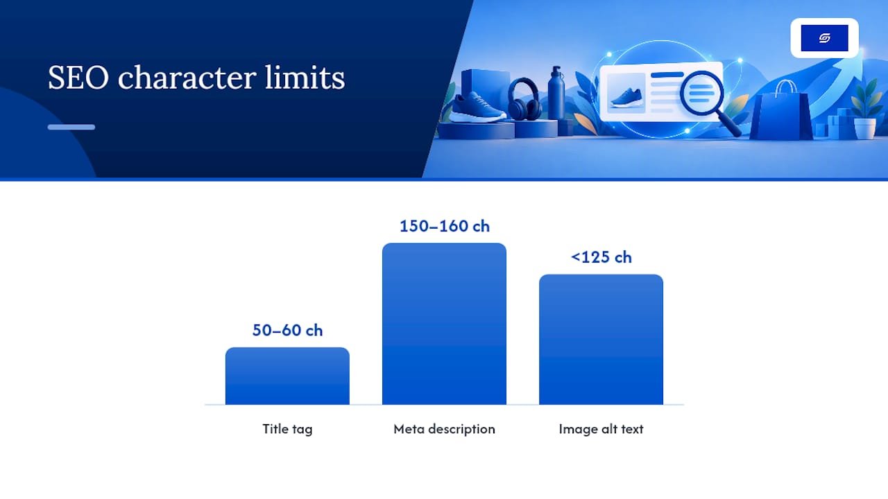
Image and media strategy that reduces returns
A minimum viable image set for most product categories includes four shot types: a clean studio shot on white, an in-scale shot showing the product against a familiar object for size reference, a lifestyle shot showing it in use, and a close-up detail shot of texture or construction. Apparel and furniture benefit from five or more images; simple accessories can work with three, but fewer than that leaves shoppers guessing.
- Link each image to its specific variant in the Shopify admin so switching colour or size updates the photo instantly.
- Use consistent file naming across your catalogue (product name plus angle) to keep your media library manageable as it grows.
- Add video or a 360 degree view for products where texture, movement, or fit genuinely change the buying decision, such as apparel, footwear, or anything mechanical.
- Compress images before upload and let Shopify’s CDN handle responsive sizing. Oversized source files slow every visitor down, even though the CDN resizes them for display.
Video and 360 views won’t suit every catalogue. A £15 phone case rarely needs one, but a £400 jacket, where fit and drape matter, almost certainly does.
Why does mobile UX matter more than desktop for Shopify stores?
Mobile traffic dominates most Shopify stores, yet Baymard’s research on product page UX found that a majority of mobile product pages perform “mediocre or worse”, largely because critical information gets buried behind tabs and accordions. Size, shipping cost, and returns policy are exactly the details a shopper needs before buying, and hiding them behind an extra tap is often enough to lose the sale.
Fixes worth prioritising:
- Replace size drop-down menus with visible button selectors so shoppers see all options at a glance.
- Keep colour and pattern swatches visible without a tap, not tucked inside a collapsed panel.
- Position the add-to-cart button so it stays within one thumb-friendly screen, ideally with a persistent sticky version as the shopper scrolls.
- Surface an estimated total cost, including shipping, near the buy area rather than forcing an add-to-cart just to see it. Baymard’s research on this specific pattern is worth reading in full if you sell anything with variable shipping costs.
Pro Tip: Run your own version of Baymard’s overview test: hand your phone to someone who has never seen your store and time how long it takes them to find the price, size options, shipping estimate, and buy button. If it takes longer than ten seconds, your mobile layout needs work before anything else on this list.
How should you A/B test a Shopify product page?
Test one meaningful change at a time. Changing your CTA colour, your hero image, and your price display simultaneously might lift conversion, but you’ll have no idea which change caused it, which means you can’t repeat the win elsewhere in your catalogue.
- Pick one primary KPI per test. Add-to-cart rate for CTA and layout changes, product page conversion rate for pricing or trust-signal changes.
- Set a guardrail metric alongside it. Average order value and return rate are the two most common; a variant that lifts conversion but tanks AOV isn’t the win it looks like.
- Run the test for a full business cycle at minimum, typically two to four weeks, to smooth out day-of-week and payday effects rather than judging from a few days of data.
- Use Shopify’s built-in experimentation tools where your plan supports them, or a third-party testing app for theme-level changes that go beyond simple content swaps.
- Roll winners out across similar SKUs in the same category, then keep watching the guardrail metric for a few weeks to catch any delayed regression.
Soodo’s guide to proven conversion optimisation strategies covers this workflow with more Shopify-specific detail if you’re setting up your first structured testing programme.
Technical performance: speed fixes that protect your conversion rate
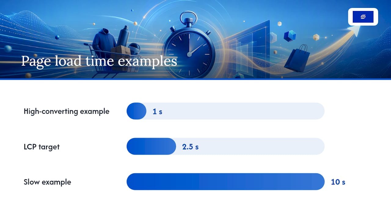
Speed problems are usually invisible to the merchant and glaring to the shopper. A site that loads in one second converts at a meaningfully higher rate than one that takes ten, according to Shopify’s own ecommerce SEO guidance, and product pages are typically the heaviest pages on a Shopify store because of image count and third-party app scripts.
Start with an app audit. Every app you install injects a script tag, and many keep running on pages where they serve no purpose. Go through your installed apps and identify which ones can be deferred until after page load, or removed entirely if they’re not delivering measurable value.
- Enable lazy loading on below-the-fold images so the browser doesn’t fetch every product photo before the shopper has scrolled to see them.
- Let Shopify’s CDN serve appropriately sized responsive images rather than uploading oversized originals and hoping the theme compresses them.
- Track Largest Contentful Paint (LCP), Time to First Byte (TTFB), and Time to Interactive (TTI) in Google PageSpeed Insights or Search Console, aiming for an LCP under 2.5 seconds.
- After major changes, request a recrawl through Google Search Console rather than waiting for Google to notice on its own schedule.
Reviews, trust signals and reducing purchase friction
Star ratings work best positioned near the product title, visible before the shopper scrolls past the price. Reviews with genuine reviewer photos and recent dates carry more weight than a static five-star badge with no context behind it, and encouraging recent reviews keeps that section looking active rather than stale.
- Display accepted payment methods and secure checkout badges near the add-to-cart button, not buried in the footer.
- Show a short shipping window and returns snippet directly beside the buy box, since this is exactly where Baymard’s research shows hesitation peaks.
- Implement aggregateRating schema through a review app that exposes proper markup, which helps your star rating show up directly in search results.
- Respond to negative reviews quickly and visibly. A brand that addresses a complaint publicly often reassures future shoppers more than a page of five-star reviews alone.
Which SKUs should you optimise first across your catalogue?
Not every product deserves the same effort on day one. Rank your catalogue by traffic, margin, and stock velocity, then work down that list rather than trying to fix everything at once.
- Fast wins: alt text, meta descriptions, and description rewrites. These take an afternoon per product and carry real SEO weight.
- Medium effort: image sets, CTA placement, and variant linking. These need design input but no development work.
- Heavy projects: theme-level layout changes, structured data implementation across templates, and page speed overhauls. These need a developer and should be planned as a project, not squeezed in between other tasks.
Batch your rollout by product category rather than jumping between unrelated SKUs, and set a rollback trigger before you start. If conversion drops more than a defined threshold within the first week of a change, revert immediately and investigate rather than waiting to see if it recovers on its own.
Pro Tip: Start your triage with the ten SKUs that drove the most revenue last quarter. Fixing your best sellers first compounds faster than spreading effort evenly across a catalogue where half the products barely sell anyway.
Why founder-led optimisation catches what generic audits miss
Most product page audits read from a checklist without asking why a specific page underperforms for a specific audience. Having consulted on more than 100 Shopify stores, the pattern Soodo sees repeatedly is that the biggest wins rarely come from a single tactic. They come from testing the right thing first, on the pages that actually carry your revenue.
The TAHAN case study is a useful example of what happens when landing page changes get prioritised by actual traffic and margin data rather than guesswork. Soodo’s own optimisation checklist is built from exactly this kind of prioritisation, not a generic list copied from a blog post.
— Soodo
Get hands-on help optimising your Shopify product pages
Reading a checklist and implementing it under deadline pressure are two different things, especially when you’re also running the business the store supports. Soodo’s Existing Shopify Store Optimization service exists for exactly that gap: a founder-led team that audits your product pages against the priorities covered here, from CTA placement through to structured data, and implements the fixes directly rather than handing you another PDF to action yourself.
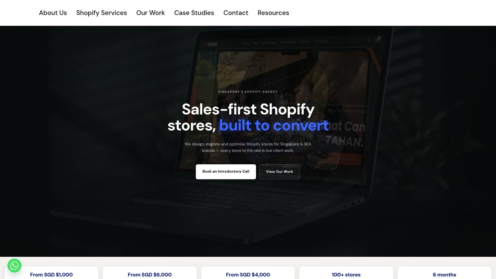
The engagement starts from a one-off fixed price and is scoped around your specific catalogue, not a template applied to every client regardless of category. If your store needs a full rebuild rather than an optimisation pass, Soodo’s New Shopify Website Development service starts from S$4,500. For merchants who want to see the prioritisation approach in action first, the free Shopify optimisation checklist covers the same framework used in client audits. Request a store audit through Soodo’s store optimisation page to get a scoped plan for your own catalogue.
Sources
The steps in this guide draw on platform documentation and independent usability research rather than assumption. Shopify’s own product page optimisation guidance sets the baseline for prioritisation and testing discipline. Baymard Institute’s product page UX research provides the mobile usability benchmarks referenced throughout, particularly around information architecture and hidden cost estimates. Shopify’s developer documentation on the structured_data filter covers the technical implementation of product schema. For a broader look at execution tactics, Baby Love Growth’s guide to optimising product pages offers additional SEO-focused detail worth cross-referencing.
- Boost Sales with Product Page Optimization (2026)
- Product Page UX best practices (Baymard)
- Liquid filters: structured_data
FAQ
What is the single most important element on a Shopify product page?
The add-to-cart button and its surrounding visibility usually matter most, since a shopper who can’t find or trust the buy action never converts regardless of how good the rest of the page looks. Pair it with clear pricing and stock status for the biggest immediate impact.
How do I add product schema to my Shopify theme?
Use Shopify’s structured_data Liquid filter, typically written as {{ product | structured_data }} within your product template, which outputs JSON-LD covering price, availability and ratings. This requires editing theme code, so a developer or an agency familiar with Shopify Liquid is worth involving if you’re not confident editing templates directly.
How long should a Shopify product description be?
There’s no fixed word count, but structure matters more than length: lead with the core benefit, follow with features and specifications, then close with practical details like sizing and care. Manufacturer copy pasted in without changes tends to underperform because it’s duplicated across competing stores.
How much does Shopify store optimisation cost?
Soodo’s Existing Shopify Store Optimization service starts from 1600 SGD one-off, scoped to the specific catalogue and issues involved. Larger rebuilds fall under New Shopify Website Development, which starts from 4500 SGD one-off.
How do I know if my mobile product page needs fixing?
Time how long it takes a first-time visitor to find the price, size options, shipping estimate, and buy button on their phone. If it takes longer than ten seconds, or any of those details are hidden behind a tab, your mobile layout needs attention based on Baymard’s usability benchmarks.
Recommended

Jessica Bong
Jessica Bong is the founder of Soodo, a Singapore Shopify agency that builds, revamps and migrates Shopify stores, with every store set up to be found in AI search (GEO). She has spent over 10 years in ecommerce and runs her own Shopify brand, Patch&Bagel, where every Soodo technique is tested first. Jessica is also a WSQ-certified Shopify trainer at Equinet Academy.