

Shopify Homepage Design: 15 Minute Audit and Copyable Patterns
A conversion-focused Shopify homepage must tell visitors what you sell within one mobile screen and load fast enough that they stick around to find out. Before you touch a theme setting, run a quick audit: check your hero message, scan your category visibility, and run a Lighthouse test on your homepage. That fifteen-minute check tells you exactly where to focus first.
TL;DR:
- Feature 30% to 40% of your main product categories on the homepage with plain labels and representative images, so new shoppers can understand your range.
- Use a static hero with one value line and one call to action; reserve a slider visitors control for two or three equally important campaigns.
- Never lazy load the hero image; Shopify Theme Store themes must average a Lighthouse performance score of 60 across home, product, and collection pages.
- Make changes in a duplicated theme, preview mobile and desktop layouts, and run Theme Check before publishing to protect the live store.
- Track LCP, CLS, conversion, and category clicks after each change, testing one hypothesis at a time and reviewing results within two weeks.
Table of Contents
- Homepage roles and core design principles for Shopify stores
- Modular homepage architecture: sections, blocks and JSON templates
- Hero, visual hierarchy and above-the-fold design
- Navigation and category UX: high-impact fixes from Baymard research
- Performance-first design: critical CSS, images and Core Web Vitals
- Using the Shopify theme editor: templates, duplicate drafts and safe edits
- Practical homepage patterns and real examples to copy
- Quick 30-60 minute checklist to build a conversion-focused homepage
- Localization and cultural customization for Singapore and Southeast Asia markets
- Integration of conversion optimization techniques specific to Shopify homepage design
- Use of data-driven design decisions leveraging analytics from top-performing Shopify stores
- Strategies for personalized customer experience on the homepage
- Soodo perspective: founder-led design and CRO approach
- How we can help with your Shopify homepage
- FAQ
- Sources
Homepage roles and core design principles for Shopify stores
Your homepage carries more weight than any other page on your store. It introduces your brand, helps shoppers find products, welcomes traffic from campaigns, builds trust with new visitors, and pushes people towards a purchase decision, all at once. When a homepage tries to do all five jobs without a clear hierarchy, none of them land well.
Five principles keep that balancing act under control:
- Clarity comes first: a visitor should know what you sell and who it’s for within seconds of landing.
- Cohesion means your colours, type and imagery feel like one brand, not a patchwork of theme defaults.
- Mobile-first design treats the phone layout as the real design, not a shrunk-down afterthought.
- Performance-first thinking treats load speed as a design constraint from the first wireframe, not a fix applied afterwards.
- Merchant-editability keeps the layout flexible enough that your team can update a hero banner or swap a campaign section without calling a developer.
Shopify’s own developer guidance makes the performance point explicit: design should never be an afterthought to speed, and visual choices need to work with Core Web Vitals goals rather than against them, according to Shopify’s performance best practices.
Once you’ve made a change, whether it’s a new hero image or a reordered section, track a short list of numbers rather than guessing whether it worked. Largest Contentful Paint (LCP) tells you how fast your main content appears. Cumulative Layout Shift (CLS) tells you whether your page jumps around while loading. Conversion rate tells you whether the layout is doing its job. Click-to-category rate tells you whether shoppers are actually finding their way into your catalogue. Watching these four together, rather than any single one in isolation, gives you a realistic picture of whether a redesign helped or hurt.
Modular homepage architecture: sections, blocks and JSON templates

Shopify’s theme structure is built around three layers that work together: sections, blocks and JSON templates. A section is a reusable chunk of content, such as a hero banner or a featured collection. Blocks are the smaller pieces inside a section, like an individual testimonial or image. JSON templates stitch sections together into a page layout you can edit visually, without touching code, as described in Shopify’s theme structure documentation. That modularity is what lets you rebuild a homepage for a seasonal campaign in an afternoon rather than a sprint.
A handful of section types cover most homepage needs:
- A hero section carries your main value line and primary call to action.
- A category strip gives shoppers a visual shortcut into your main product lines.
- A spotlight section highlights a bestseller, new arrival or limited drop.
- An editorial section tells a brand story or showcases lifestyle imagery.
Reuse these same section types across landing pages and campaign pages rather than inventing new ones for every promotion. Consistency speeds up both your design process and your customers’ ability to recognise what’s happening on the page.
On the development side, resist the urge to split every homepage element into its own micro-section. Over-granular sections bloat your JSON template, slow down the theme editor and make Liquid harder to maintain. Reserve app blocks for functionality that genuinely needs them, such as reviews widgets or loyalty points displays, rather than using an app for something a native section already handles.
Pro Tip: Keep a clean, section-based master template saved as a duplicate so you always have a known-good starting point before testing a new layout.
Hero, visual hierarchy and above-the-fold design
The hero is the single highest-leverage piece of real estate on your homepage, and it works best when it does one job clearly rather than several jobs badly. A strong hero carries one value line that states what you sell, one call to action that tells visitors what to do next, and a supporting image or short clip that reinforces the message. Multiple competing buttons in the hero, “Shop Now” next to “Learn More” next to “Join Our List”, split attention and slow down decisions.
Visual hierarchy on mobile follows a few consistent rules:
- Use a clear font scale so the headline is obviously the biggest thing on screen, with body copy and labels stepping down from there.
- Give your primary CTA button enough colour contrast that it’s the first thing a thumb reaches for.
- Frame product photography so the subject isn’t cropped awkwardly on narrow screens.
- Keep critical text and buttons away from the very edges of the viewport, where they’re easy to miss or mis-tap.
Carousels look appealing in a design meeting, but they come with a real cost: only the first slide reliably gets seen, and every additional slide after it adds weight without adding attention. A static hero with one strong message generally performs better than a rotating one unless there are two or three equally important campaigns, in which case a simple user-controlled slider may be beneficial.
Testing shows that a large majority of users scrolled nearly the entire mobile homepage on their first visit, according to Baymard Institute’s mobile homepage research. That means your hero doesn’t have to carry your whole pitch alone: what sits just below the fold matters almost as much as what’s visible on load.
Navigation and category UX: high-impact fixes from Baymard research
Your homepage navigation is doing more work than it gets credit for. Baymard Institute’s large-scale usability testing identified 11 best practices for homepage and category navigation, covering everything from how categories are labelled to how deep a mega menu should go, as outlined in Baymard’s homepage and navigation research. Not every recommendation carries equal weight for a typical Shopify store, so prioritise the ones with the biggest payoff first.
Start with these, in order:
- Show full-scope category links on mobile, not a truncated “More” menu that hides half your catalogue.
- Feature your top categories directly on the homepage, so new visitors don’t have to hunt for a menu to understand your range.
- Use representative category imagery rather than generic stock photos that don’t reflect what’s actually inside.
- Keep category labels in plain language your customers already use, not internal merchandising terms.
- Avoid overly deep nesting in dropdown or flyout menus, which costs taps and patience on mobile.
On mobile specifically, Baymard’s testing found that a significant share of mobile homepages risk setting the wrong expectations because they don’t feature a diverse enough spread of product categories, according to Baymard’s mobile homepage usability findings. The same research suggests featuring a substantial portion of your top-level categories on the homepage, either visually or textually, so a first-time visitor can quickly infer the full range of what you sell, rather than assuming you only stock whatever happens to be in the hero image.
Run through this checklist during QA before you publish a homepage change:
- Does the mobile menu show full category depth, not a collapsed subset?
- Are at least a third of your top-level categories visible somewhere on the homepage?
- Do category tiles use real product photography rather than placeholder stock imagery?
- Are category labels written the way your customers would search for them?
- Does the mega menu (if you use one) stay shallow enough to scan in a few seconds?
Pro Tip: Ask someone unfamiliar with your store to find a specific product type from your homepage alone. If they hesitate or scroll past it, your category structure needs work.
Performance-first design: critical CSS, images and Core Web Vitals
Speed isn’t a separate concern from design on Shopify: it’s a gate you have to clear. To be accepted into the Shopify Theme Store, a theme must hit a minimum average Lighthouse performance score of 60 across home, product and collection pages, according to Shopify’s performance best practices. That baseline exists because a beautiful homepage that loads slowly loses customers before they ever see the design.
Critical CSS handling makes a measurable difference to how stable your homepage feels while it loads. Styles needed for the content visible in the initial viewport should load synchronously; deferring or loading them asynchronously can cause visible layout shifts as the page settles, as detailed in Shopify’s guidance on loading critical CSS synchronously. In one real-world example, removing async CSS loading from above-the-fold content greatly improved Cumulative Layout Shift, based on the same Shopify developer documentation. The practical takeaway: keep critical CSS render-blocking for your hero and above-the-fold sections, and defer the rest by section index in your Liquid templates.
Image handling is the other lever worth pulling first:
- Use responsive
srcsetsizes so mobile visitors aren’t downloading a desktop-sized hero image. - Never lazy-load your LCP image, usually the hero banner, since lazy-loading delays exactly the content Lighthouse measures first.
- Compress product and lifestyle photography before upload rather than relying on Shopify to do all the work automatically.
- Test real-world load behaviour with Lighthouse, real user monitoring (RUM) data and a filmstrip view, not just a single lab score.
For a deeper walkthrough of real-user monitoring and ongoing speed maintenance, our guide on Shopify speed optimisation covers the monitoring side in more detail than fits here.
Using the Shopify theme editor: templates, duplicate drafts and safe edits
Every homepage change should start on a duplicate, never on your live theme. Duplicating your theme gives you a safe draft to work in, test on a preview link, and discard if something doesn’t work, without any risk to the store your customers are currently browsing.
From there, the workflow is straightforward:
- Duplicate your current theme from the Themes page and rename it clearly, such as “Homepage test, March”.
- Open the duplicate in the theme editor and make your section, block or hero changes there.
- Create a custom JSON template if you want a landing page or campaign homepage distinct from your default, and assign it through the template picker rather than overwriting your main homepage file.
- Preview on mobile and desktop using the theme editor’s device toggle before approving anything.
- Run Theme Check locally or on a development store to catch Liquid errors and parser-blocking scripts before they reach production, as recommended in Shopify’s guidance on templates, sections and blocks.
- Publish the duplicate once it passes preview and Theme Check, replacing your live theme in one step.
Resist leaning on third-party apps for layout changes a native section can already handle. Every extra app adds script weight, and script weight is one of the fastest ways to undo the performance gains you just made.
Practical homepage patterns and real examples to copy
Most effective Shopify homepages fall into one of four patterns, and picking the right one depends on how your customers shop rather than what looks impressive in a portfolio.
- A category-led homepage leads with a grid of product categories just below the hero, suited to stores with a broad catalogue where shoppers arrive without a specific product in mind.
- A product-led landing page puts one hero product or collection front and centre, suited to a single-product brand or a major launch.
- An editorial or lookbook layout leans on lifestyle photography and storytelling before products appear, suited to fashion or home brands where the look sells as much as the item.
- A seasonal campaign strip slots a time-limited promotion directly under the hero, suited to stores running frequent sales or drops.
Placement matters as much as the pattern itself. Category tiles work best in a horizontal scroll or two-column grid immediately after the hero on mobile, where thumbs can swipe without much effort. Product thumbnails inside a spotlight section should keep consistent aspect ratios so the grid doesn’t look uneven on smaller screens. Your CTA button should repeat at least once more below the fold, not just in the hero, since most visitors scroll well past the first screen before deciding.
Whichever pattern you choose, the mobile version needs the same conversion cues as desktop: a visible CTA, clear category access and trust signals such as reviews or guarantees, just resized and reordered for a narrower screen rather than stripped out entirely.
Quick 30-60 minute checklist to build a conversion-focused homepage
You don’t need a full redesign to make a meaningful difference. This sequence covers the highest-impact changes in under an hour.
- Duplicate your theme and open the copy in the theme editor.
- Rewrite your hero content: one value line, one CTA button, nothing competing for attention.
- Add or tidy a category strip directly beneath the hero, showing your top product lines.
- Add a product spotlight section for a bestseller or current promotion.
- Check your image settings: confirm responsive sizing is enabled and your hero image isn’t set to lazy-load.
- Run a Lighthouse test on the draft homepage and note your LCP and CLS scores.
- Fix your top three flagged issues, usually oversized images, render-blocking scripts or layout shift from late-loading fonts.
- Publish, then recheck Lighthouse on the live page to confirm the fixes held.
Validate as you go rather than waiting until the end: check image file sizes before publishing, confirm the CTA is visible without scrolling on a real phone, preview the mobile layout specifically, and treat LCP and CLS as pass or fail checkpoints rather than numbers to review later.
If a change underperforms after a week, rolling back to your saved duplicate takes minutes. For anything more than a gut-feel comparison, a simple A/B test, running the new hero against the old one for a fixed traffic split, gives you a clearer answer than eyeballing before-and-after screenshots.
Pro Tip: Screenshot your current homepage before you start. It’s the fastest way to spot what actually changed once you’re three edits deep.
Localization and cultural customization for Singapore and Southeast Asia markets
A homepage that converts well in one market can fall flat in another if the details don’t match local expectations. Currency display matters more than most merchants assume: showing prices in the shopper’s local currency rather than forcing mental conversion removes a small but real point of friction at the browsing stage.
Payment method visibility on the homepage or just below it also carries weight. Shoppers across Southeast Asia are used to seeing familiar local payment options represented early, and a trust badge row showing the payment methods you accept can do as much for confidence as a reviews widget.
Imagery and tone matter too. Lifestyle photography that reflects your actual customer base, rather than generic Western stock imagery, tends to build trust faster. Seasonal campaign timing is another detail worth checking against regional calendars rather than assuming one global promotional schedule fits everywhere you sell.
None of this requires a separate homepage per market. A well-structured JSON template, combined with Shopify Markets or a translation app, lets you adjust currency, language and featured categories for different audiences while keeping your underlying section architecture the same.
Integration of conversion optimization techniques specific to Shopify homepage design
Conversion optimisation on a homepage works best when it’s built into the section architecture from the start, rather than bolted on as an afterthought. Trust signals, such as a review count, a guarantee badge or a “as seen in” strip, perform best placed close to the primary CTA rather than buried in a footer nobody scrolls to.
Urgency and scarcity cues, a countdown for a sale or a low-stock flag on a spotlight product, work when they’re accurate and specific; vague or recycled countdowns erode trust faster than they build urgency. Social proof in the form of a review carousel or user-generated content section tends to perform best directly beneath a product spotlight, where it reinforces a decision the visitor is already close to making.
Repetition of your primary CTA deserves more attention than it usually gets. A single “Shop Now” button in the hero is easy to scroll past; the same CTA repeated after your category strip and again after your product spotlight catches visitors at different points in their scroll without feeling repetitive, provided the wording stays consistent. For a deeper set of conversion fixes beyond the homepage itself, our Shopify CRO framework walks through the same logic applied store-wide.
Use of data-driven design decisions leveraging analytics from top-performing Shopify stores
Opinions about what “looks good” on a homepage are far less useful than data about what your specific visitors actually do on it. Scroll-depth tracking tells you how much of your homepage people actually see, which matters directly for where you place your category strip or second CTA. Heatmap tools show whether visitors are clicking on elements that aren’t even links, a common sign that your visual hierarchy is sending the wrong signals.
Funnel data from your analytics platform, whether that’s Shopify’s native reports or a connected tool, tells you where homepage visitors drop off before reaching a product or collection page. If click-to-category rate is low, the fix is usually navigation or category visibility rather than the hero itself. If visitors reach a collection page but bounce quickly, the issue often sits with product page design rather than the homepage at all, which is a separate audit covered in our product page optimisation guide.
Treat every homepage change as a hypothesis you can check against data within a week or two, not a one-off creative decision. Small, measured changes, tested one at a time, build a clearer picture of what actually moves your conversion rate than a full redesign ever will.
Strategies for personalized customer experience on the homepage
Dynamic, behaviour-based content on the homepage can lift relevance without requiring a custom build for every visitor segment. Showing recently viewed products to a returning visitor, or a “welcome back” treatment for logged-in customers, reconnects them with their last session instead of starting cold every time.
Geolocation-based content, adjusting featured categories or currency display based on where a visitor is browsing from, works well alongside the localisation approach covered earlier, provided it’s set up through Shopify Markets or a vetted app rather than custom scripting that risks slowing the page down.
Behavioural segmentation, such as showing a different spotlight section to a first-time visitor versus someone who’s browsed multiple collections in the same session, can meaningfully lift relevance, though it adds technical complexity and is worth testing in isolation before rolling out store-wide. Keep any personalisation layer lightweight: a personalised homepage that loads a second slower than your standard one will usually cost more in lost conversions than it gains in relevance.
If you’re testing creative variations across social channels to pair with homepage personalisation, tools like Larven’s free ad and ecommerce tools can help generate and test ad creative without a separate production step.
Soodo perspective: founder-led design and CRO approach
Many merchants over-invest in visual polish and under-invest in the two things that actually move the needle, message clarity and load speed. Improvements often come not from a visual overhaul but from tightening the hero message and cutting load-blocking scripts.
A typical homepage audit we run covers category visibility, hero clarity, mobile Lighthouse scores and a short roadmap of A/B tests, prioritised by expected impact rather than ease of implementation. That order matters more than it sounds: the fix with the biggest expected lift should always come before the one that’s merely quickest to ship.
— Soodo
How we can help with your Shopify homepage
If you’d rather hand the hero rewrites, speed fixes and category restructuring to a team that does this daily, that’s exactly where we come in. Our new Shopify website development service covers a full build from 6,000 SGD one-off, including a sales-first homepage structured around the principles in this guide.
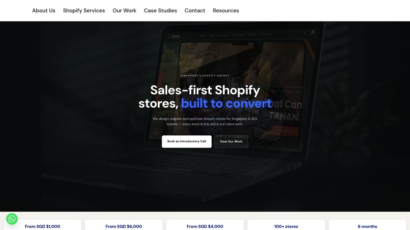
If your store already exists and just needs sharper conversion performance, our existing Shopify store optimisation service starts from 1,000 SGD one-off and focuses on exactly the kind of hero, navigation and speed fixes covered above.
- A homepage and site-wide CRO audit covering hero, category structure and Lighthouse performance.
- Fixed project pricing, so you know the cost before work begins.
- Direct WhatsApp support throughout the build, rather than a ticketing queue.
You can also browse our portfolio of past Shopify projects to see how these patterns play out on live stores, or get in touch to request a homepage audit and a prioritised list of fixes for your own store.
FAQ
What should a Shopify homepage include above the fold?
A strong above-the-fold section includes a single clear value line, one primary call to action and a supporting image, without competing buttons or messages. Testing shows 70% of users scroll through nearly the whole mobile homepage anyway, according to Baymard’s mobile usability research, so the fold doesn’t need to carry your entire pitch alone.
How many product categories should appear on the homepage?
Baymard’s research suggests featuring 30 to 40% of your top-level categories on the homepage, either visually or as text links, so new visitors can quickly understand your full product range, as detailed in Baymard’s findings on mobile homepage usability. Showing too few categories risks setting the wrong expectations about what you actually sell.
What Lighthouse score does a Shopify homepage need?
To qualify for the Shopify Theme Store, a theme needs a minimum average Lighthouse performance score of 60 across home, product and collection pages, according to Shopify’s performance best practices. Custom and purchased themes aren’t required to meet this threshold to run on your store, but it’s a useful baseline to test against regardless.
Should I use a carousel or a static image in my hero?
A static hero with one clear message usually outperforms a carousel, since only the first slide reliably gets seen by visitors. A carousel can work if you genuinely have two or three equally important campaigns running at once, but it should never be used to cram competing messages into a single space.
How do I edit my homepage without breaking my live store?
Duplicate your current theme, make all your changes in the duplicate, and preview it before publishing, so your live store stays untouched until you’re ready. Running Theme Check on the draft before publishing catches Liquid errors and script issues that could otherwise slow the page down, as recommended in Shopify’s developer documentation.
Sources
- Performance best practices for Shopify themes
- Theme structure — Shopify Help
- 664 Mobile ‘Homepages’ Examples – Baymard Institute
Recommended

Jessica Bong
Jessica Bong is the founder of Soodo, a Singapore Shopify agency that builds, revamps and migrates Shopify stores, with every store set up to be found in AI search (GEO). She has spent over 10 years in ecommerce and runs her own Shopify brand, Patch&Bagel, where every Soodo technique is tested first. Jessica is also a WSQ-certified Shopify trainer at Equinet Academy.